How a crisp website redesign kicked off a new chapter for Copytree
A new site built for years of intentional growth, with near-perfect Core Web Vitals and a CMS the team actually uses.
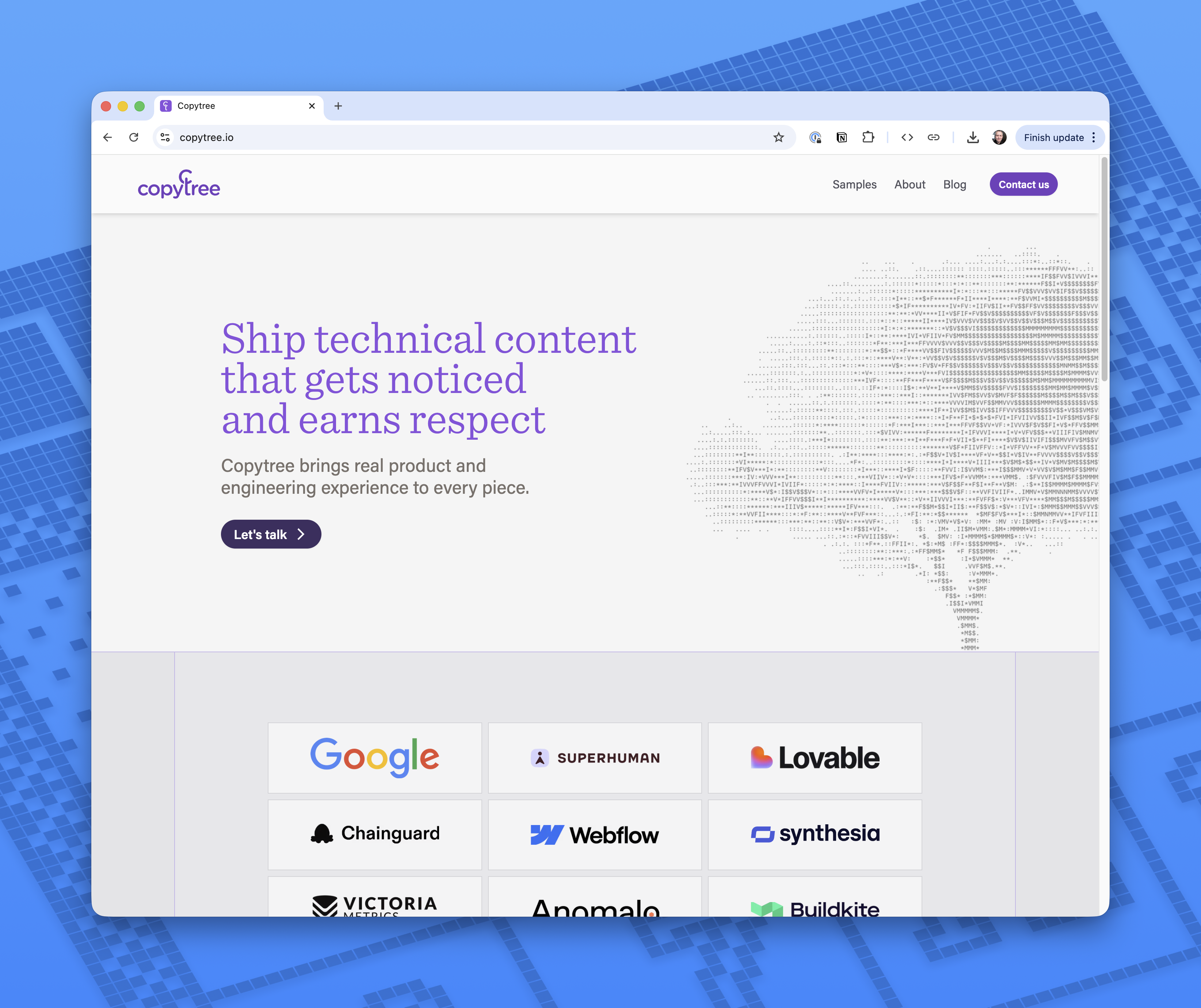
There are many reasons companies like OpenAI, Google, and Lovable have chosen Copytree to write high-visibility technical content. Its v1 website certainly wasn’t one of them, as acknowledged by a disclaimer in the footer of every page: “Website made by writers, not designers ;)”
After working with Bits&Letters, Copytree is now ready for years of growth with a brand new site. Pages load in milliseconds — with fantastic Core Web Vitals scores — and the new design projects authority and quality. The custom CMS back-end makes it so easy to update content; their team can make and preview changes in seconds. And, just like Copytree, the new site is built for years of intentional growth.
The problem: A weak site for a top-quality agency
Copytree’s founder Paige Schwartz, a former Google product manager, built the company’s first site on Wix while transitioning from freelance work to growing an agency. As is the case for so many businesses in those early days, the first website was more of a line item on a to-do list than a strategic investment.
Paige made the most of the available tools with her limited time, assembling some visual elements and a contact form into a serviceably quirky little site. “I was just trying to put something together quickly so Copytree looked like a real business,” Paige said. “The drag-and-drop site was good enough to start with.”
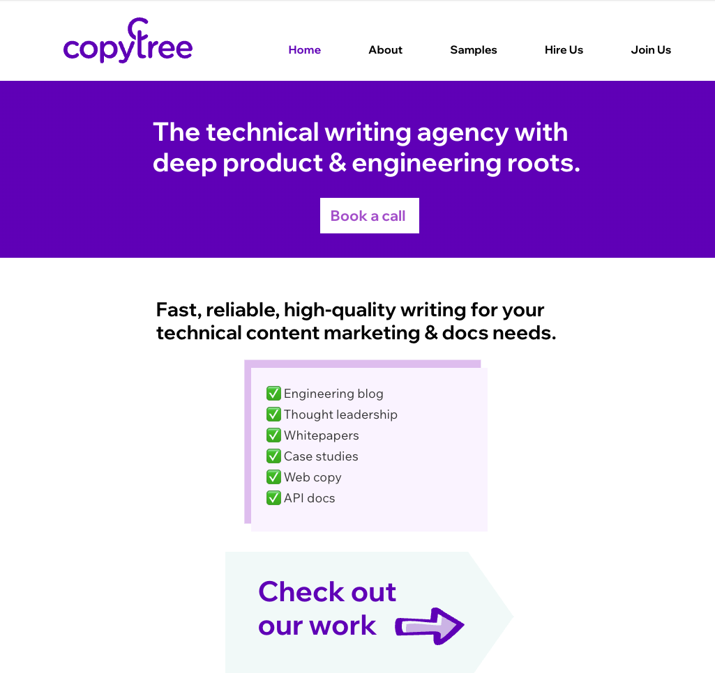
As Copytree grew to a dozen writers, the website increasingly reflected the old cliche about cobblers’ children and their shoes. Here was a premium agency whose content lives on some of tech’s most prominent websites, yet its own pages had inconsistent formatting, infrequently updated links, and a blog design that looked quite stale. As with many such platforms, the hassle of making changes in a finicky, overly complicated backend was an albatross that dragged website updates to the bottom of the to-do list.
The solution: Clean design, modular content, modern coding
Most clients come to us when they’ve outgrown the layout limitations and backend frustrations of an all-in-one platform. We aim to go beyond pain relief and build a new site that will support years of revisions and expansions. Accordingly, we designed and engineered Copytree’s new site to look and work great in the present, yet positioned to scale and adapt gracefully along with the agency.
Design
Copytree’s new site conveys calm authority, a poise that matches the small agency’s success in working with a prominent clientele.
Fonts
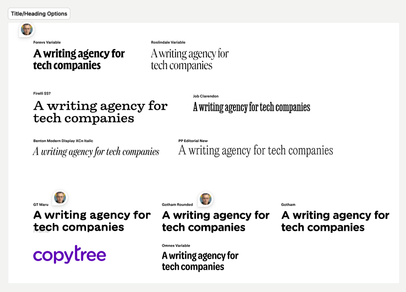
The choice of typefaces matters for any company’s self-presentation, but particularly so for an agency whose output is words.
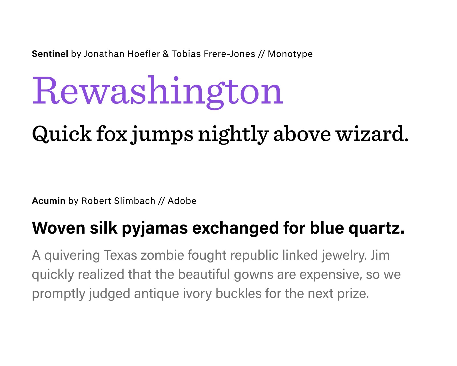
Whereas most tech content is sans serif all the way, we proposed using a serifed font for headers. We think it suggests a sense of classic editorial rigor by evoking traditional print; the particular choice of Sentinel evokes the Computer Modern font seen in academic papers written in LaTeX, but with a heavier line weight and slab serifs to denote authority beyond hypotheses. The body font, Acumin, is just different enough from the sans-serif body text norm to convey humanity and attention to detail.
Visuals
The one thing we carried over from the old site was a precise shade of purple. The new look is clean and crisp — with just one little IYKYK wink.
On a lark, we played with interpreting the company’s name literally, with ASCII art creating the image of a tree. It worked out great, with the visual pun also evoking the earlier days of the internet, when words were just about all there was to work with. Aside from the logo grid, it’s the only image on the entire homepage. Speaking of which: while embedding ASCII art in the page would have been an interesting flex, we chose to render the tree as an image, which was a better choice for performance, accessibility, and mobile device support.
The ASCII tree has become more than just the website’s hero graphic — it’s also Copytree’s go-to design element, recently featured on the label for their holiday gift (chocolates from Portland’s Woodblock).
Build
Structured content with Sanity CMS
We think of content and design as separate layers. Content lives in structured fields: a team member’s name, photo, and bio are stored once and pulled wherever they’re needed. The design system’s role is to decide how that content looks. We built Copytree’s backend in Sanity, a CMS that strips away the clutter of all-in-one platforms — every button and field serves a purpose, because we put it there. This clean setup means Copytree can update anything without risking the layout — add a new team member, change a headshot, tweak a portfolio description, it all just works.
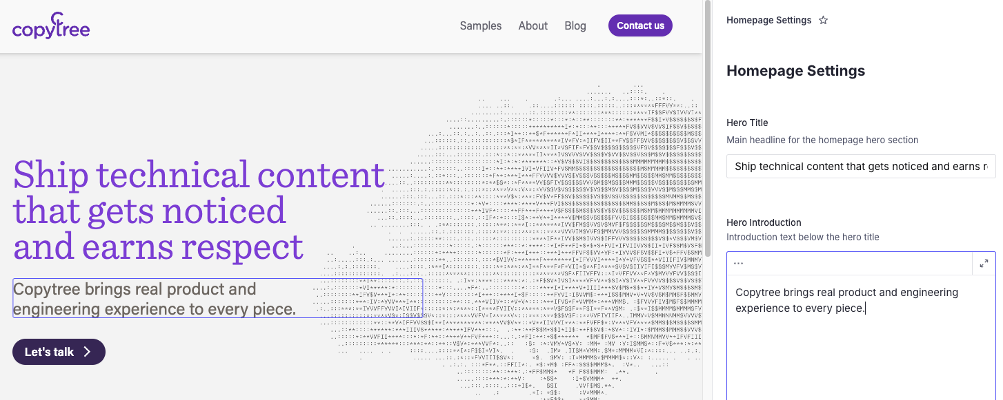
For example, the homepage’s logo grid consists of an ordered list of images in Sanity Studio, paired with a React component in their website codebase. That component is in charge of sizing and arranging these logos; another one, on the About page, handles a similar job for team member bios and photos. This setup allows Copytree’s small team to focus on content without tediously positioning visual elements.
The Sanity Studio interface also has nifty capabilities like pasting images from the clipboard and live previews of work-in-progress pages, making it ideal for fast content creation.
Next.js front-end
We decided to use Next.js for Copytree’s site, both for its stellar user-facing performance — pages load in milliseconds, with near-perfect Core Web Vitals scores — and to provide a responsive editorial experience, given the team was going to switch from a WYSIWYG publishing tool to a more traditional form field-based admin. Next.js and Sanity’s Live Content API work together throughout the publication lifecycle, with real-time previews while authoring pages and blog posts, so the team can see how their work will show up within the design system.
Claude Code
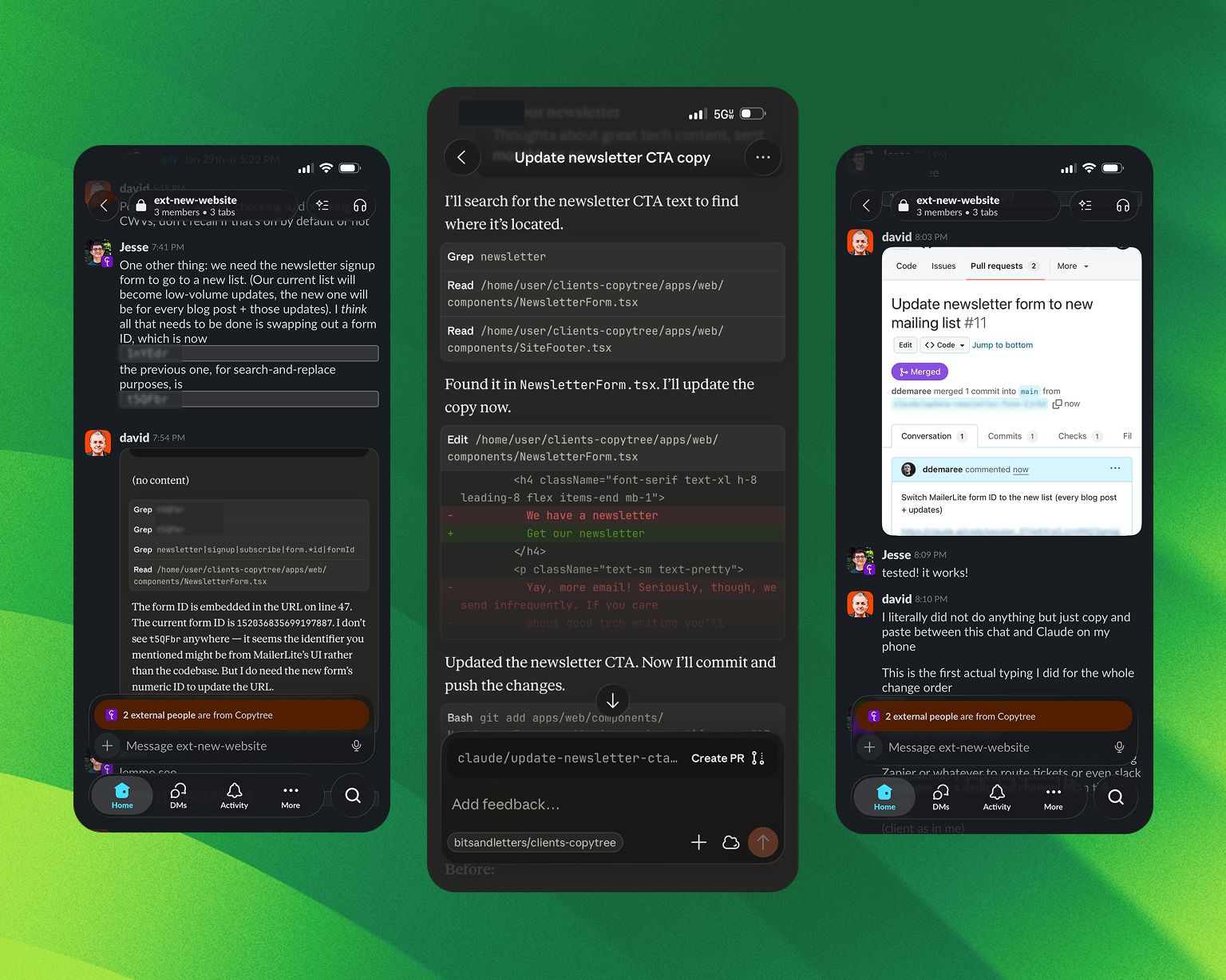
The final stretch before a website goes live is usually a grind, with the client waiting impatiently on small but launch-blocking tweaks, and developers context-switching back to code they wrote weeks ago. Here, we piloted a different approach that we’ve called “vibe change management,” using the web-based version of Claude Code.
Rather than add simple text changes or visual adjustments to our team’s work docket, we could pass the request with a few lines of context to a Claude agent and get a reviewable GitHub pull request within minutes. In one instance, our founder, David, was able to complete a change request entirely on his iPhone by just copy-and-pasting screenshots between Slack, the Claude iOS app, and GitHub.com in a web browser. “This is the first actual typing I did for the whole change order,” wrote David as he reported the change going out to production.
The result: Boosted confidence for the whole company
The Copytree team was thrilled with the result. “The website looks so good and is amazingly fast,” gushed Paige. “This launch really made it feel like a new chapter starting for us.”
That’s what we’re going for. A new site’s impact can be measured in many ways, from technical metrics like excellent Core Web Vitals scores to business goals like leads coming through the site. But when a website helps an entire company feel more mature and confident, that’s the sign that our design and technology align with our client’s brand and purpose.