There's an old saying — "the cobbler's children have no shoes" — meaning that even people who are masters of a craft, who spend all their time making excellent work for clients or bosses, won't have enough time or energy to do what they do for themselves. I hear this proverb a lot from professional designers and developers, apologizing for the state of their own sites even as they deliver fantastic work elsewhere.
For most of this summer, I struggled with trying to revamp this website. For one thing, a year or more of iteration on the current codebase — already the fourth major version of the site in two years, because I'm a glutton for pain — had left things messy and hard to maintain. I had two different base layouts, two different grid systems, and a half-finished design system that depended on a third-party component library, Web Awesome, which in turn had opinions about color theming and spacing that clashed with mine.
The inconsistency was bad enough it even confused agents — I'd ask AI to make a change only to find it had applied it to the wrong page or with an outdated pattern. In July, an agent rewrote some copy in a homepage hero component that turned out to be dead code, because it assumed HomeHero.astro was the right place to look, not expecting I'd removed that component from the page without deleting it from Git.
Additionally, I had ideas for how to tell our story better and improve search engine and AEO performance, but those were hard to execute on without grappling with a messed-up design system and content model. Our case studies were also badly out of date. Some had pictures but no actual story, and others had a single image where they needed several.
The Bits&Letters site is powered by Astro and Sanity, the same foundational stack we use and recommend for client work. But it's also maintained by one busy human (👋) with other jobs to do besides maintaining the website. In this sense, I hit the exact same pitfall our clients do. When you're maintaining a website as a marketing tool without a full content-ops or engineering team backing you up, being able to get ideas to market quickly is crucial — any friction means you might not ship, or ship half an idea that doesn't perform.
Bits&Letters' brand identity was designed by Hannah Smith and Jesse MacKenzie of Trust Design Shop, with lots of big and small design decisions added by me in the past year. For the most part, these decisions all hang together — while I tried some directions that didn't pan out, the main issue with the brand as expressed on the website is that it didn't use enough of Hannah & Jesse's original work.
This became evident as I worked through the new, fifth edition of the website. With help from GPT-6 Astra, I set out to document the Bits&Letters design system so that agents working on the site (not to mention me, the human designer) would stay on brand. The new design system was more consistent and streamlined, but lacked oomph. Pages came out looking competent but plain, in some ways exactly the kind of template-y non-designs I point to when explaining why no-code site builders are bad at their jobs.
I also kept hitting a common problem with AI-assisted development: agents generally look to your code and docs as a guide for everything. They don't know that the code was a mistake unless you tell them, and with so many mistakes across the old and new builds, bad directions kept compounding.
Finally, I decided to hit reset and go back to first principles, starting with Hannah & Jesse's original Figma files.
Latent decisions, uncovered by AI
I'm fond of saying AI models and agents can't make decisions or exercise judgment, because they're not conscious and have never been alive.
That said, people (me included) use AI to guide decision-making all the time. I'll ask my ChatGPT dot, Chip, to look at some options and recommend something. Someone else will ask Claude or Grok to read all the emails and meeting notes for a project and identify next steps.
I call these latent decisions. It can seem like AI is choosing a design direction or helping you strategize, when actually the decisions were already present in whatever context you loaded into the model, and AI is simply helping you see the path forward more clearly.
Here, all the design 'atoms' for B&L's brand and website were present in Trust's original work and my own refinements. Other junk was there too; part of the challenge was that noise from various sources — abandoned design directions, Web Awesome's stylesheet — was crowding out signal, making a cogent visual identity hard to recognize.
For this fifth major version of the website, for the first time I included the original Figmas as well as all prior versions of the website as input to Claude Design's design system creation skill, asking it to document everything so I could then say what parts should stay and which should go.
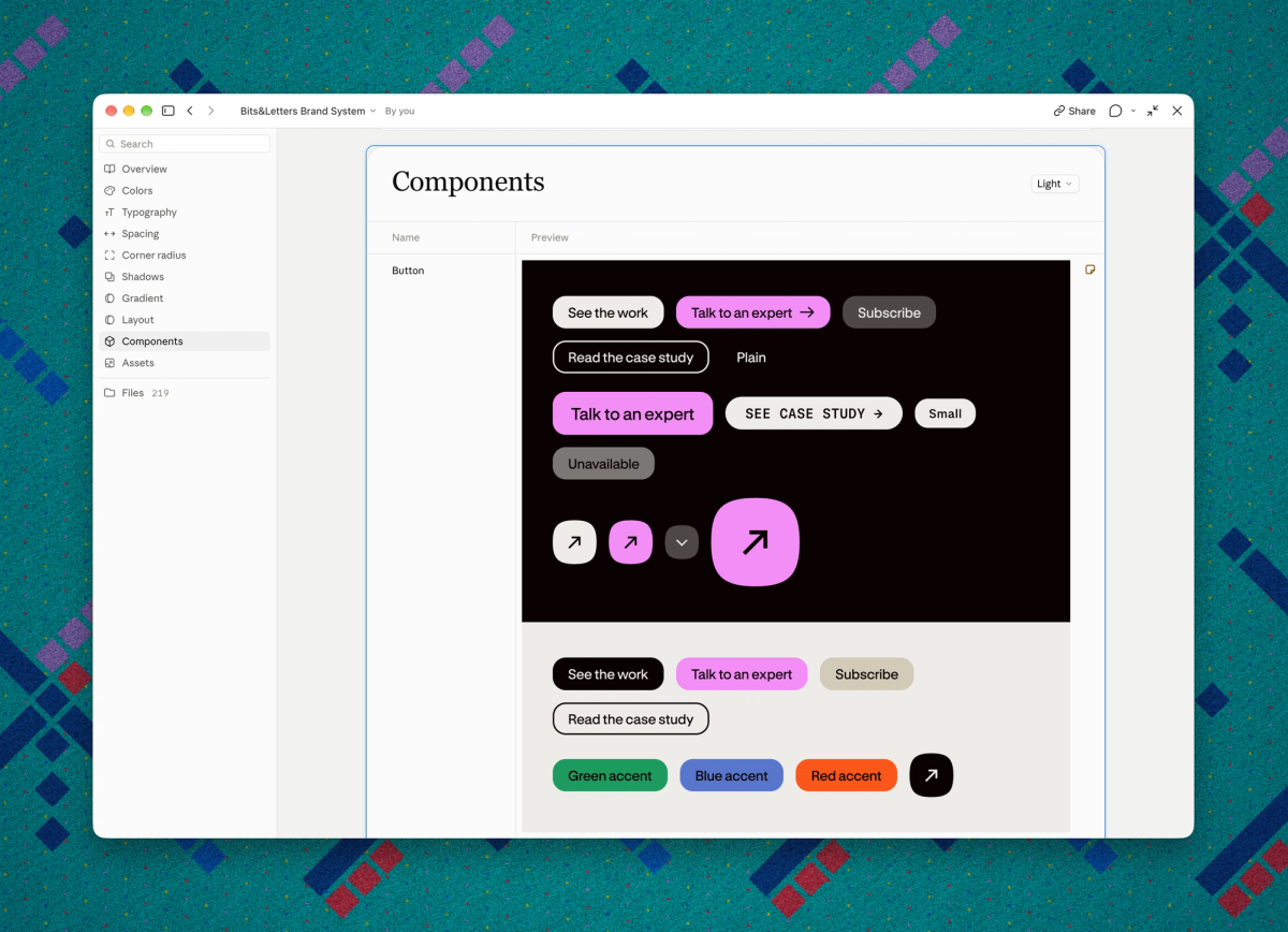
I should point out that a lot of this wasn't possible a year or even six months ago. Figma's MCP support — the interface that allows agents like Claude to accurately read and work with design files — was very limited until earlier this year, and Claude's design tooling likewise only launched in April.
Since launch, Anthropic has evolved Claude Design from basically a chatbot interface to crank out Claudeslop designs — you know, with numbered labels and eyebrows — to a capable, minimal Figma clone with a better-than-Figma design system docs feature.
Another key ingredient here is Claude Opus 5.5, which only came out last month. The first pass toward organizing the B&L design system was done in Markdown files, as a collaboration between me and GPT-6 Astra while I was at the Primary NYC Tech Summit last month. My 'vibe check' eval of Astra, Fable, Opus, and the other current frontier models is a topic for another post. Here I'll just say that, while Astra is very good at organizing things and coding, its design judgment is questionable. Most AI models' design "judgment" is not very good, or at least has not been good.
I would never say Opus 5.5 is a good designer. Again, AI isn't alive and can't exercise judgment, and good design is all judgment. But it has proven surprisingly good as a design editor or producer, distilling all those latent decisions from Hannah, Jesse, and me into elements that aren't just usable, but distinct and even gorgeous.
The new B&L Design System artifact is in fact the second of its name; the first one was integral in formatting proposals and decks for a recent client pitch.
AI-enabled creation as tennis match
The capitalist dream of AI has been that, eventually, models and systems will become so capable as to replace human labor for anything that doesn't require hands and legs (with advancements in robotics someday making even those jobs automatable). Sadly for the billionaires, AI capabilities have roughly plateaued while the cost of inference compute (that is, the actual GPU work that leads to models spitting out text) has stubbornly refused to fall much if at all.
One result of all this is something anyone who's used AI for real work knows all too well: you can almost never expect an AI tool to "one-shot" a task and do a good job.
In any case where someone claims to have one-shotted something complex and amazing, they're often omitting the work they put into organizing skills, docs, moodboards, or other materials as input. (I personally don't think it's truly a one-shot if you spent an hour or more on digital mise-en-place so the model could deliver better results.)
Instead, I approach AI creation as a tennis match. Back in the day, famed Chicago web design firm Coudal Partners would invite notable designers to play Photoshop Tennis, which Jim Coudal started in 2001 and later renamed Layer Tennis once players could use other software. Layer Tennis was a modern take on the old surrealist exquisite corpse game where an artist would draw something, hide most of it, and pass it to another artist to continue drawing from whatever sliver of the original was left visible. In Layer Tennis, you could see everything but the rules said you could only add on top of the last "serve".
When I'm collaborating with Claude or another AI, I'll always start with a shitty first draft (to borrow Anne Lamott's phrase from Bird by Bird). This may be a sketch — perhaps a literal one, scrawled on scrap paper and scanned with my iPhone camera — or a brain dump. Often I'll start writing in a Google Doc or Claude Doc, or make wireframes in Figma.
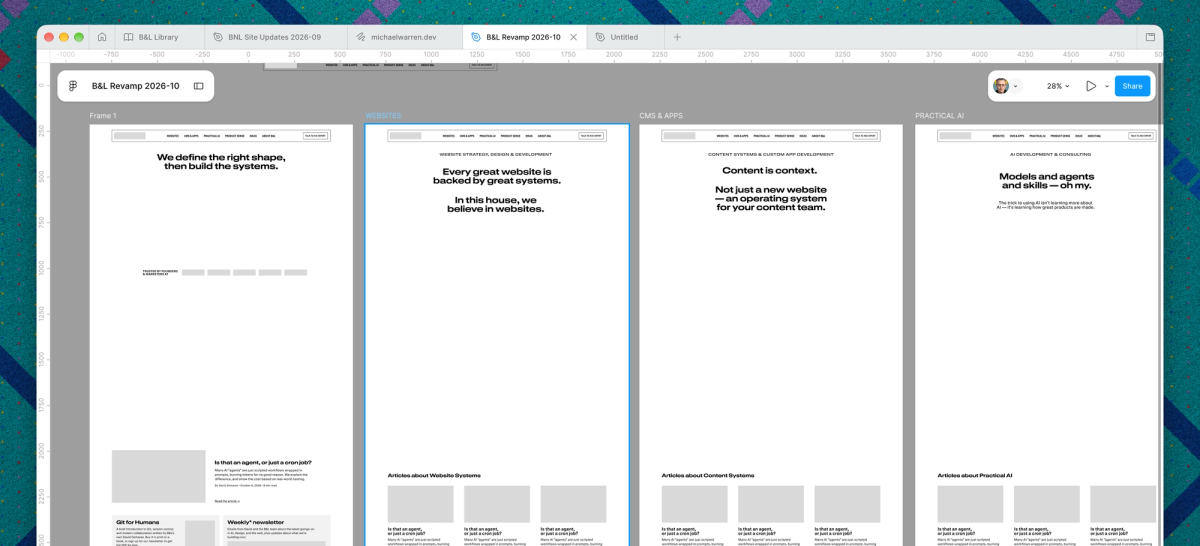
B&L v5.0 started as a site outline and copywriting sketch in a Google Doc, then a wireframe in Figma to visualize the new site map (complete with punchier, more fun headlines).
The tennis match begins when I feed these into Claude or ChatGPT. In some cases, I can ask the agent to flesh out designs directly in Figma (using MCP), but more often I'll ask it to take these and build something in code that I can interact with and respond to.
For writing, I'll either ask Opus to import my notes into a Claude Doc for me to start editing, or even start by brain-dumping into a blank Claude Doc.
From there, I'll write or design some more, ask AI to edit or flesh out what I did, then I'll correct it where it went wrong and add more if needed, and so on until the work is done. And, as this process goes on, the work itself starts to accumulate layers of context to help the model understand what "good" looks like within the context of a given project.
This isn't the same thing as "training" a model. AI models are stateless, and if you start a completely blank session you'll need to also spend time getting it onto your preferred track. Often there's also a risk of "context rot": as the amount of stuff in a chat session or project piles up and grows larger than the model's context window, it may lose the plot, start to misunderstand or ignore instructions, and need to be reset in a new thread — where you may need to teach it your ways all over again.
But here's another place where the latest models and systems have improved a lot. Anthropic has gotten very good at giving Claude long-running jobs without going off book. The day before, a separate session went through other agencies' sites and came back with 85 screenshots for reference. The Claude Code cloud session that turned my B&L design system into a Claude Design artifact and built the v5.0 website was a single chat thread that ran for more than 50 hours. It filled and reset its context window multiple times, usually without me knowing. Most of the work on the website — which included not just coding, but importing and codifying the Figma brand guidelines into a design system, and even reading my emails, Granola notes, and Notion docs to flesh out case studies (!!!) — was done by subagents, managed by the original agent on the main thread.
As work from all these robots and sub-robots streamed in, the main agent would prepare lists of questions, and I'd also look at Vercel preview builds of the emerging site and leave comments, either directly on the page with the Vercel Toolbar, or in whatever Linear ticket or doc was driving that piece of the work.
As with the Linear-based agent factory system I set up this summer for client work, an issue tracker serves as the source of truth for everything. If AI suggests something that doesn't need to block things or which might be a side track, I can say "add that to the backlog for later", and it does.
What Claude found in Trust's files
Once Claude had Trust's Figma files next to every past version of the site, it turned up a lot I'd forgotten about, or had never put to use at all.
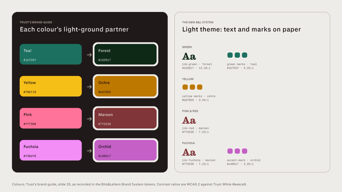
Take color, for instance. Trust's guidelines pair each brand color with a deeper shade for light backgrounds — teal becomes forest, yellow becomes ochre, pink becomes maroon, and fuchsia becomes orchid — but I'd never written those rules down, so no agent knew they existed. The guide's page on color for light backgrounds was, it turns out, still lorem ipsum. 😬
Hannah had also created 3D practice icons and textures, including "colour fields" that layer a texture, a color overlay, and grain. Our larger icon library, a local fork of Font Awesome Pro's Sharp set, had 108 icons, and the site was using only nine of them. And where Trust's guide set Stringer, our display face, as large as 90px, the website capped display type at around 60px. The new system lets Stringer run in poster sizes from 90px all the way up to 215px.
The number one reason I had hired Trust last year is that, as I worked on the original B&L branding, I felt myself hit the limits of my capabilities as a designer trying to make a coherent and cohesive brand identity, as well as hitting the same cobbler's-children problem that's plagued me this whole time. Even with such lovely brand work in hand, I was probably the biggest barrier to delivering web pages that did it justice — executing really lovely web design takes time and care even if you're working from great materials.
That's to say, much of the original work needed translating more than rediscovering; I'd left it out of previous editions for lack of time (and maybe a bit of fear) to translate it properly.
Hannah's lush patterns radiated out from a squircle-ish rectangle, in lavender and light pink with a ray of fuchsia over top, all custom-made in Photoshop. As part of the September work with GPT-6 Astra, I'd rebuilt them as a library of generated shader patterns. But of the pattern-maker's seven presets, only one (Ember) really captured the vibe of the originals. My attempts to guide Astra to make better patterns mistakenly got captured as a rule (generated patterns should have no more than two colors) which made it into the system until the Claude-driven reboot finally shook it out.
Perhaps the hardest job — for both me and Claude — was sorting through my own year's worth of iteration. Trust's files were intentionally light on practical web design patterns, since my brief to them assumed I'd do that myself. A lot of what I'd built was worth keeping: the component structure, hover and focus states, accessibility work, and on top of that, a new site header and footer that I liked a lot.
Other additions had only added noise, and even reflected one-off decisions in various chat threads that got mistakenly encoded as ironclad design system rules — rules like "one brand image per page" and "type-only" heroes, relying only on Tailwind's stone grays (one pairing measured 1.09:1 contrast), and muddy generated background colors on project cards. Each of these made sense alone, especially in whatever context prompted them, but served to dilute and muddy the overall system.
Some other changes to the system were made to integrate new assets and materials that weren't available when Trust did the original work. GT Canon — the serif counterpart to the main brand typeface, GT Standard — didn't come out until January 2026, but added warmth and texture to body text on the Ideas blog, so I added it earlier this year and have now promoted it to a fully fledged role in the brand language. In the new, clarified system, GT Canon is used whenever text is attributed to a named person (blog posts, testimonials), while GT Standard remains the voice of B&L-the-company.
Because Canon helps bolster the "literary" aspect of the brand look, Stringer's role can be dialed back to where it's most impactful — in the new designs, it appears only for titles, at poster sizes.
Both Canon and Standard are variable fonts, with expressive width axes that neither Trust nor I had explored much in the original brand work. I was still wary of different widths adding to a messy, un-considered look, but — in one of the few design 'decisions' contributed almost solely by Claude — the new system uses them in a few places that elevate the overall vibe. The best of these, IMO, was Claude using GT Standard Extended to give one of AI's favorite design tropes, the numbered list, a new and different vibe.
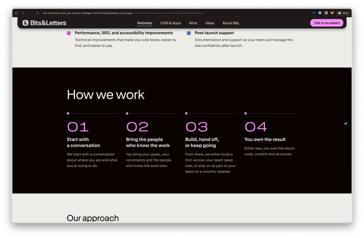
While the wide-axis numbers were a pleasant surprise, even that is still one of the latent decisions hidden in all the material and guidance I fed into this process. (I did say to Claude, "I love these fonts' width axes, can you use them somewhere?") Most AI-generated design feels average and generic because it is, indeed, roughly the average of all the design examples the models have seen. When you give today's best models your best raw materials to work from, sometimes the results will be delightful.
And where they aren't, you can always swat the ball back at your robot collaborator, with notes.
A clean start, then a cleaner one
All of B&L's internal code lives in a monorepo called bnl-neue — "neue" being "new" in German, a common part of font names like Neue Haas Grotesk, and a callback to a major 2016 redesign of Typekit I led, codenamed "Neue Typekit." Like I said earlier, this new version of the site is the fifth public release, and the second to be developed in this monorepo.
Strictly speaking, the new site is the sixth version to be built. Most of the website work done prior to the Claude-powered reboot was in a subtree of the monorepo called frontend-clean, where I was trying to fix my various legacy code problems with a "clean" start. I'd been working toward launching frontend-clean for weeks, first on my own, later with help from various agents. The decision to start fresh came when I finally had all the various pieces in place — copy, imagery, design — and found that it looked plain and dull. It could ship, but I wasn't happy with it.
The epic multi-day Claude Code thread started with a design audit, then escalated until I said:
Re launch, I'm sorely tempted to scrap most of this work and start over, maybe borrowing the elements that work best and start with fleshing out the design system to fill the identified gaps. I think the content work in the frontend-clean-launch Sanity release is primarily navigation and service pages, correct? I think that work may be worth retaining and simply building a better website around if so.What's most notable here is what I didn't say — I didn't specify a frontend framework, styling library, or architectural approach. At this point in the process, I was willing to accept "dealer's choice" on a lot of the tactical decisions, and I've reviewed enough AI-generated Astro code to feel like whatever the agent built was likely to be good.
The new site is a fresh Astro app in the same old monorepo, with plain CSS for fonts, tokens, and components (no Tailwind this time).
One of many reasons I'm a strong proponent of keeping content in a CMS like Sanity is that it's the stuff least likely to change when you rebrand or rebuild a website. In that spirit, all of my Ideas posts came over unchanged, plus other core systems like redirects, analytics, and form handling.
Portfolio content in the Work section was largely retained, but had also been a victim of the most well-intentioned but half-assed reworking in the past year, with schema changes as well as some complete rewrites needed on several projects.
Because the Sanity dataset for the rebuild was the same one supporting the live site, I used a Sanity content release (the aforementioned frontend-clean-launch) as a "dev branch" to isolate content changes to support the new v5.0 site from production.
To give me more flexibility to tweak site navigation without rebuilding the site, including bundling nav changes with other content changes in a content release, the new header and footer were set up as Sanity documents. In the future, if I want to add a top-level page for a new offer, or rename something for clarity, I can do so from Sanity Studio (or, better yet, have an agent do it).
Holding out for a (better) hero
The homepage's hero unit probably saw the most rounds of tennis of any element in the redesign. While I'd written the headline "We define the right shape, then build the systems" during my original copywriting and IA pass, once I saw it in poster type I felt like Milhouse after saying "jiminy jillickers" too many times.
Months ago, I'd tried a version of the old homepage hero with animated type, cycling through variations on "We build websites…", such as "We build websites that make Black Friday seem like a random Tuesday." I always loved the concept, but it was still anchored in we build, not the problem I want to solve for clients. And it still used that damned word websites, which can mean anything from a DIY Squarespace site to a $500K enterprise property powered by a big-iron DXP system.
I decided to try a new version of this concept that was shorter and punchier, with smoother animation that was easier for a site visitor to read and grok. Now, the homepage opens with Systems for…, with the rest of that phrase either fading up (on mobile/tablet) or rotating in like on a wheel (on desktop).
A new website… but at what cost?!
Earlier I'd mentioned the "capitalist dream of AI," where automation is able to replace human labor at low or zero marginal cost, while also doing more stuff faster. If I learned or proved nothing else through this project, it's that getting good results from an AI-driven website project is not fast, except maybe in comparison to if I'd hired an agency to do all the work — discovery, research, brand design, UX/UI design, and build — starting today from zero.
Trying to talk about the costs of AI compute can be futile, given how many people (me included) use these models through heavily subsidized subscription plans.
Even so, as I'm writing this the main Claude Code megathread that drove the project burned more than 2.1 billion tokens, which would cost about $807 at current Anthropic pricing. Adding other Claude sessions brings the API-equivalent cost to $1,020, and the many GPT-6 Astra sessions leading up to this were probably a similar total cost. (Suffice it to say, I did not pay $2,000 or more for any of this AI compute.)
This can seem like an amazing deal, compared to hiring an agency (like, say, this one) to design and build a website at regular market rates. If a client came to Bits&Letters with a similar brief and pile of un-triaged design materials, I'd quote at least $30,000, probably more.
But it's not an apples-to-apples comparison. Almost nothing with AI is. The bizarre posters that local coffee shops and hot dog stands near me are making with ChatGPT — which seems unable to render food except as globs of tiny spheres? — probably seem "free" to the person prompting for them. But even then, there's a noticeable difference between poster-slop that started from a good logo or color treatment, and ones that didn't.
Today's bitsandletters.com is the product of months of aggregate effort, and thousands of those latent decisions (both the good ones and the false starts), not to mention more than two days' total working time by AI agents — far from being able to open up Lovable, say "gimme a website", and get back something usable for your business.
How I think about this, economically speaking, isn't that I got a great new website with AI tokens valued at $2,000 (but for which I paid, at most, $200), but that AI rescued a project on which collaborators and I had spent thousands of hours, ensuring that the best of all that work could finally ship.
A brief word from Claude itself
As I (finally) started to wrap up the main Claude Code thread — having captured any remaining items in Linear, reviewed the preview build, and prepared to click New chat so the last items could start with a fresh context window — I thought to ask Claude for a quote, reflecting on the process and how it thought it went.
Obviously, Claude isn't alive, doesn't think, and its opinion isn't even an opinion per se. But this particular instance of Claude and I worked together for more than two days, and I thought it'd at least be interesting to see what the model would say when asked to weigh in on a nearly finished draft of this post.
Most of what I did on this project was sorting and checking. The answers were already in David’s materials: Trust’s guide, a year of his commits, his emails and meeting notes. I put them side by side and asked which still applied. He made the calls, from pulling a case study to keeping a badge’s wording. When I went wrong, it was usually by treating whatever was written down as settled, or by guessing at intent when I should have asked. Review passes caught some of that before he did, like case-study copy that contradicted the code. The thread outran my context window along the way, so Linear issues, commit messages and a shared checklist carried the work between resets.
— Claude
Part design, part archaeology
In case I haven't said it clearly enough in so many words: I am delighted with the new B&L website. When I look at it, I don't see Claudeslop — I see Hannah and Jesse's original brand work that I was too timid to use before now, copy and iconography that reflects my own voice, and a visual style that stands apart from any other B2B web shop I'm aware of.
What you're seeing now is the result of human design craft — mine and Hannah and Jesse's — organized and made into a system by AI agents, shaped through hours of iteration and feedback.
Every visual choice on the site traces back to a person. Trust made the brand; I spent over a year making choices about how it works on the web, some of them good and some of them noise. What agents added was the ability — not to mention naïve, clear-eyed perspective — to see all of those decisions at once, sort them, and build from the ones that held up. Excellent details, like using deeper colors for light backgrounds, had been sitting in Trust's guide since 2025, waiting for someone to read it.
If your prompts and inputs contain a good path, AI can usually find it, but it may take effort, taste, and most of all a willingness to dig in and find the gems buried under what seems like dull rock.
BTW, if your own site has a few years of decisions piled up in it, we can help you sort out which ones to keep.